0072: The Frame, Part I
The GTK Frame isn’t complicated to use, but I’m doing this write up for a few reasons:
Framestyles aren’t handled the way I expected,- making the contents of a
Framelook good takes a bit of effort, and - the flexibility of
FrameLabelplacement begs coverage.
So, without further ado, here’s our first example…
Frame On


Getting a Frame into your application is straightforward. In this case, we toss it into an AppBox object like we’ve done with so many other widgets:
class AppBox : Box
{
	int _borderWidth = 10;
	bool expand = false, fill = false;
	uint globalPadding = 10, localPadding = 5;
	FrameOn frameOn;

	this()
	{
		super(Orientation.VERTICAL, globalPadding);
		setBorderWidth(_borderWidth);

		frameOn = new FrameOn();
		packStart(frameOn, expand, fill, localPadding); // LEFT justify

	} // this()

} // class AppBox
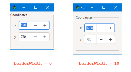
One key difference is that not many other widgets demand that we pay attention to the white space around them. But the Frame needs a tweak or two in this area and that’s why there’s a _borderWidth variable along with a call to setBorderWidth(). Without it, the Window crowds the Frame and aesthetics go out the window… so to speak. You can see the effect of _borderWidth in the screen shot above.
And just FYI, the same principles we used in customizing a Dialog’s content area can be applied here.
And that takes care of aesthetics. The Grid—which holds all the widgets that show up in the Frame—gets a bit of elbow room and it’s heading in the direction of looking nice. But let’s put aesthetics aside for a moment and talk about…
The Frame Class
class FrameOn : Frame
{
	private:
	string titleLabel = "Coordinates";
	FrameChildGrid frameChildGrid;

	public:
	this()
	{
		super(titleLabel);
		frameChildGrid = new FrameChildGrid();
		add(frameChildGrid);

	} // this()

} // class FrameOn
No big mysteries here. Set up a label string and a child container to put in the Frame and we’re all set.
You may wonder why a child container is needed and here’s the lowdown: The Frame is derived from Bin which can only hold one child object. Using a Grid to hold the children seems a good idea to me because, like the custom Dialog we looked at back in that series, the Grid gives us flexibility and ease for layout as well as future-proof-ness. In other words, the Grid ain’t going nowhere in GTK 4.0.
But as I hinted earlier, right out of the box (or should I say “Bin?”) the Frame Label is shoved all the way to the left and that just doesn’t look right to my designer’s eye, so let’s look at a couple of things we can do about that.
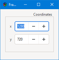
High Label Placement, Right Justified


If, for whatever reason, you need the Frame Label above and to the right, aligning it is achieved with the setLabelAlign() function which takes two arguments:
xAlignfor horizontal placement, andyAlignfor vertical.
Here’s what that code might look like:
class FrameHigh : Frame
{
	private:
	string titleLabel = "Coordinates";
	FrameChildGrid frameChildGrid;
	float xAlign = 0.95, yAlign = 1.0;

	public:
	this()
	{
		super(titleLabel);
		setLabelAlign(xAlign, yAlign);
		frameChildGrid = new FrameChildGrid();
		add(frameChildGrid);

	} // this()

} // class FrameHigh
The values for both of these variables (xAlign and yAlign) range between 0.0 and 1.0 with meaningful values extending out to two decimal places (ie. 0.95, 0.32, etc) meaning you get pretty fine control over placement. The difference between how the xAlign and yAlign values are interpreted are as follows:
xAlignvalues:0.0is pushed up against the leftFrameedge,1.0is pushed against the right edge, and- you can use as many decimal places as you want for placement, although any more than two is likely too fine to distinguish.
yAlignvalues:1.0is above theFrame,0.0is below, and0.5is vertically centered on theFrame.
Note: If you leave the Frame’s Label in the default vertical position (ie. where it intersects the Frame’s top horizontal border) it will likely never look good to place the Label all the way to the right or left where it will overlap the Frame’s vertical line. For that reason, I consider 0.05 as being the furthest left you’ll wanna go and 0.95 to be the furthest to the right.
Low Placement of the Frame’s Label


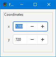
Here, the Label is placed at yAlign’s lower limit of 0.0 and the leftward limit of 0.05 so that the Label appears to be about the same distance from the Frame’s upper and left border lines.
Conclusion
And that’s about all for now. Next time, we’ll take up this Frame business again and look at two things:
- (irony mode on) the invisible
Frame(irony mode off), and - using CSS to ‘decorate’ the
Frame.
Until then, happy what-have-you.
Comments? Questions? Observations?
Did we miss a tidbit of information that would make this post even more informative? Let's talk about it in the comments.
- come on over to the D Language Forum and look for one of the gtkDcoding announcement posts,
- drop by the GtkD Forum,
- follow the link below to email me, or
- go to the gtkDcoding Facebook page.
You can also subscribe via RSS so you won't miss anything. Thank you very much for dropping by.
© Copyright 2024 Ron Tarrant
